


1
2
3
4
5
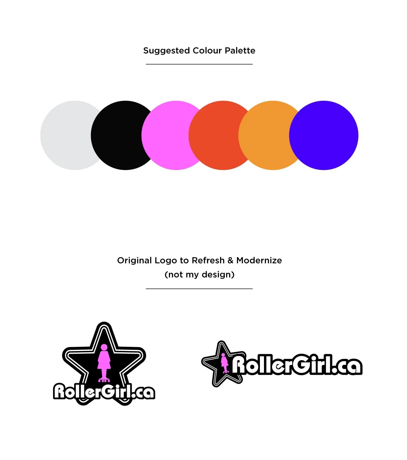
The objective of this project was to refresh and modernize RollerGirl’s logo design, while keeping the spirit of their original logo. The goal being a more professional version of itself using the same colours and a flat simplistic design that also works well in black + white.
The dominant logo design shown here is my personal favourite, but not the one they ultimately chose. I love this one because it’s fun, playful, and unique. The rolling letterforms fit together in such a way that creates a nice visual balance with the stars.
Below are a few of the logo designs presented as options throughout the process. I also presented a few colour palette options, with the one shown here being my top choice.